Ottawa-based Burst Ciders, faced a unique challenge as the first infused hard cider maker in Eastern Ontario. Positioned to set the trend for infused cider branding, Burst found itself in a 'blue-ocean' environment, allowing near-limitless creativity.
Project Key Stats
3 cider styles
produced
50+ Establishments
served Burst Ciders
350% growth
in sales from first year
Acquired
by Orleans Brewing Co.
Background + Objectives
Driven by a passion for crafting innovative cider flavours, Burst sought a brand identity that could evolve across a diverse line of flavours while maintaining brand continuity and building strong brand awareness.
As a new entity, the Burst project aimed to create a brand identity system that captured Burst's commitment to being welcoming and authentic and embraced the modern and creative spirit that set it apart in the infused cider market.
Strategic Development
A comprehensive brand identity discovery process revealed Burst's essential attributes of approachability, authenticity, boldness, and creativity. The team delved into the nuances of Burst's unique position, considering the brand's desire to be approachable and professional.


Burst's market is those who enjoy a drink but not the bloat of beer.
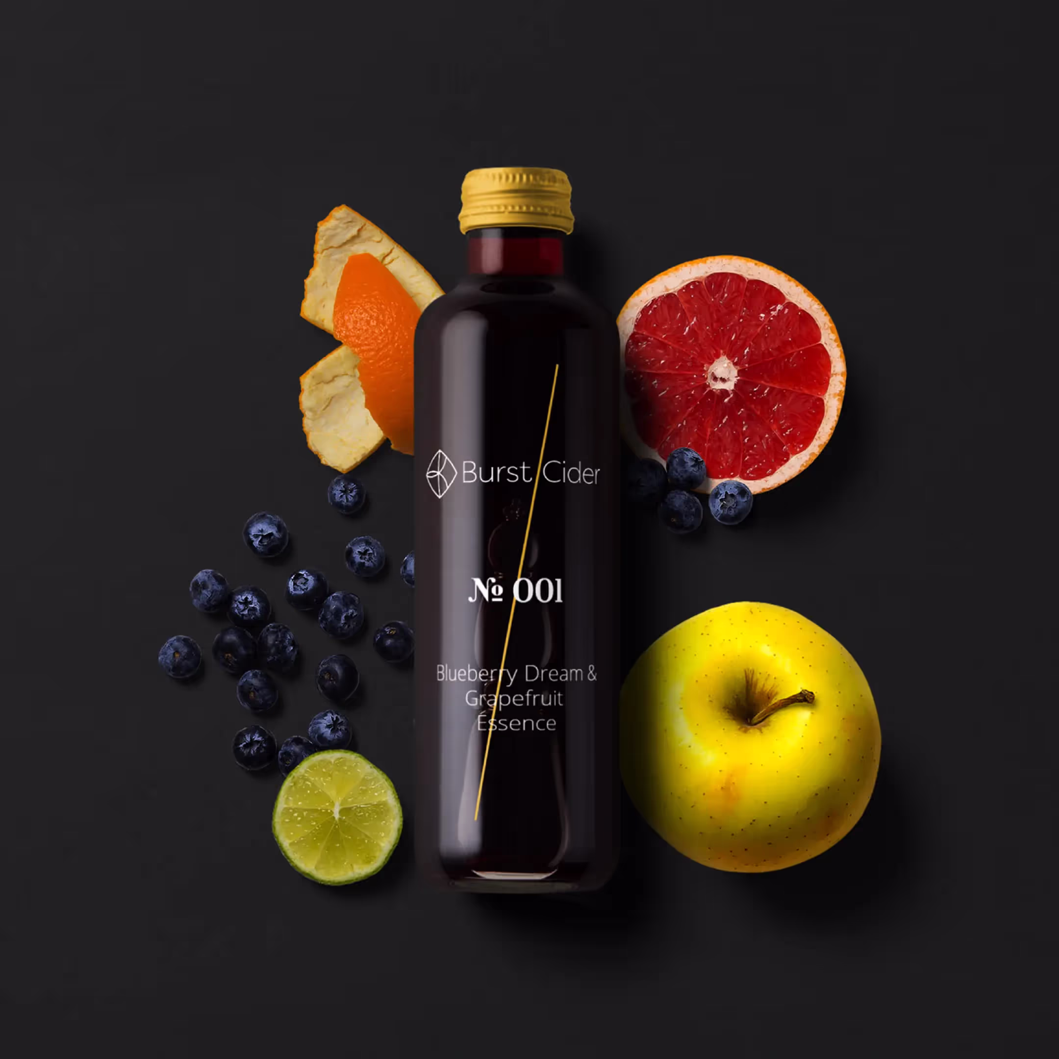
The brand identity was meticulously crafted to spotlight its primary unique value proposition: the infusion of different fruits with apple ciders. This emphasis on flavour diversity became the cornerstone of the brand narrative, creating a visual and messaging identity that celebrated Burst's innovation in cider crafting. The secondary benefit, providing enjoyable beverage experiences with fewer calories than beer, complementing the primary focus on flavour, enhancing Burst's overall appeal.
Identity Design
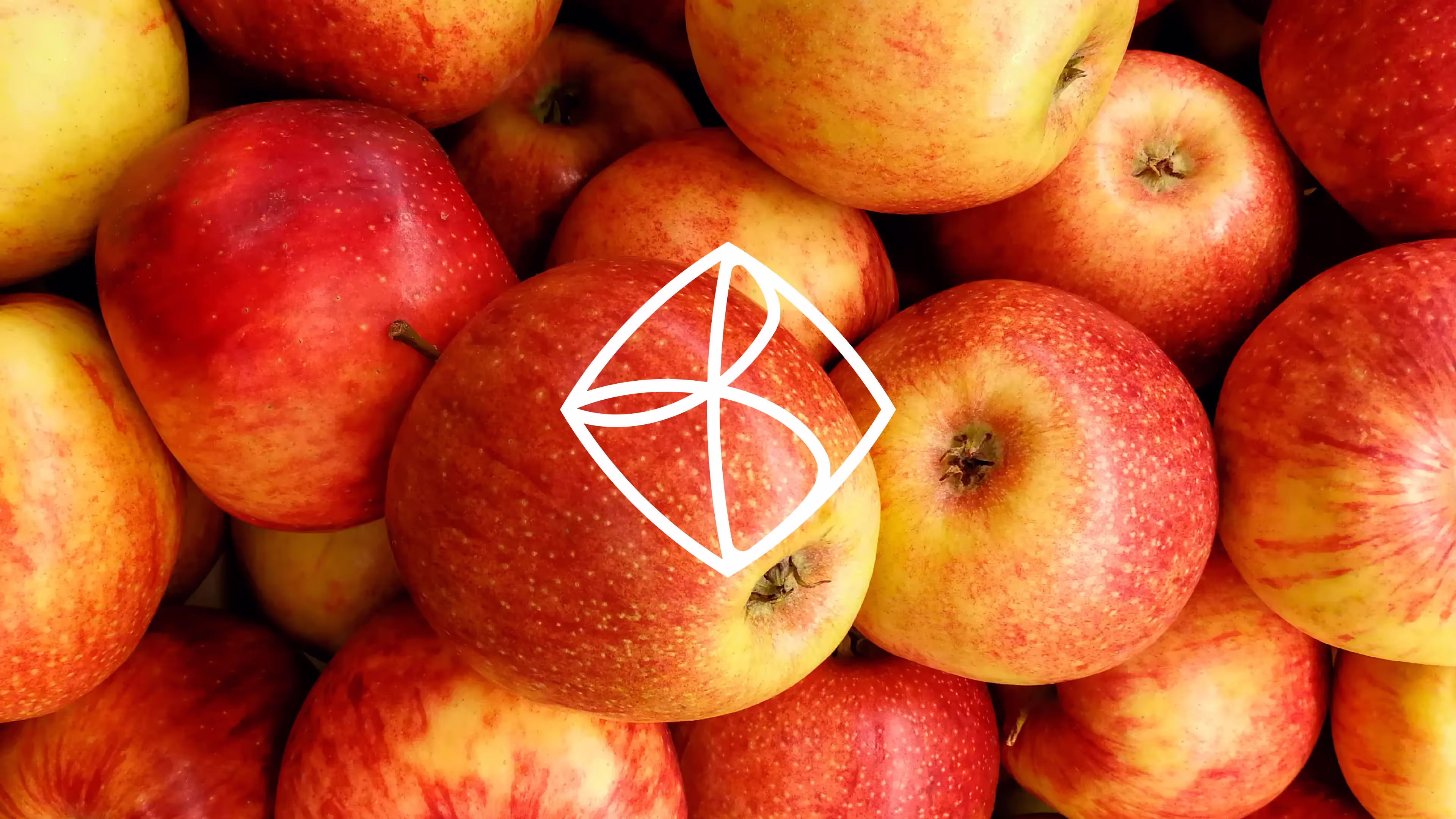
The logomark was designed to be "bursting at the seams" and has the motif of a 'B' made up of overlapping elements which represents the infusion of multiple flavours in Burst's beverages. The B is seen as pressing out against the edges of its container, showing the company bursting out of the confines of craft cider makers. This helped visualize how Burst is leading the way with infused flavours and a bold crisp identity.
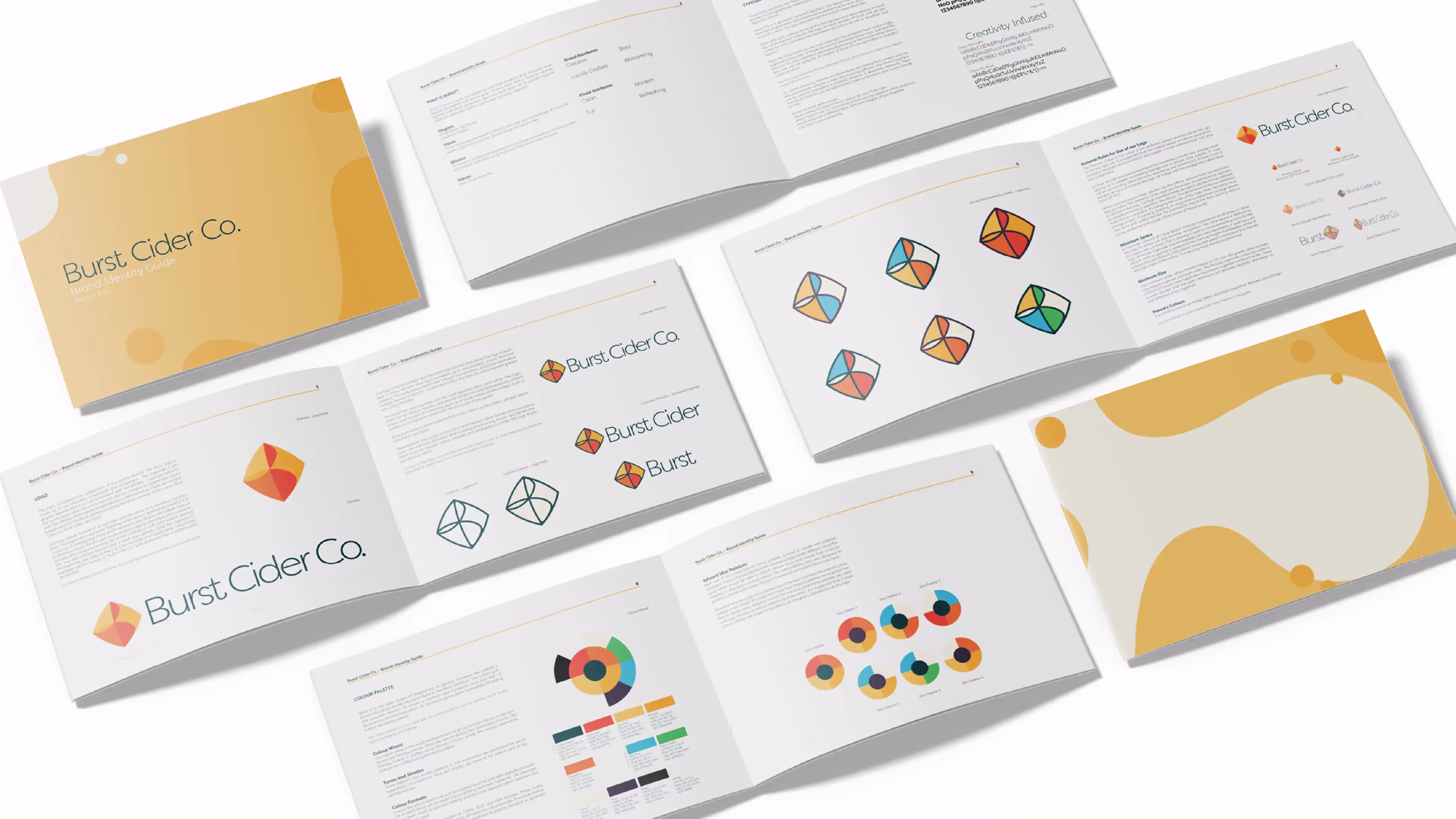


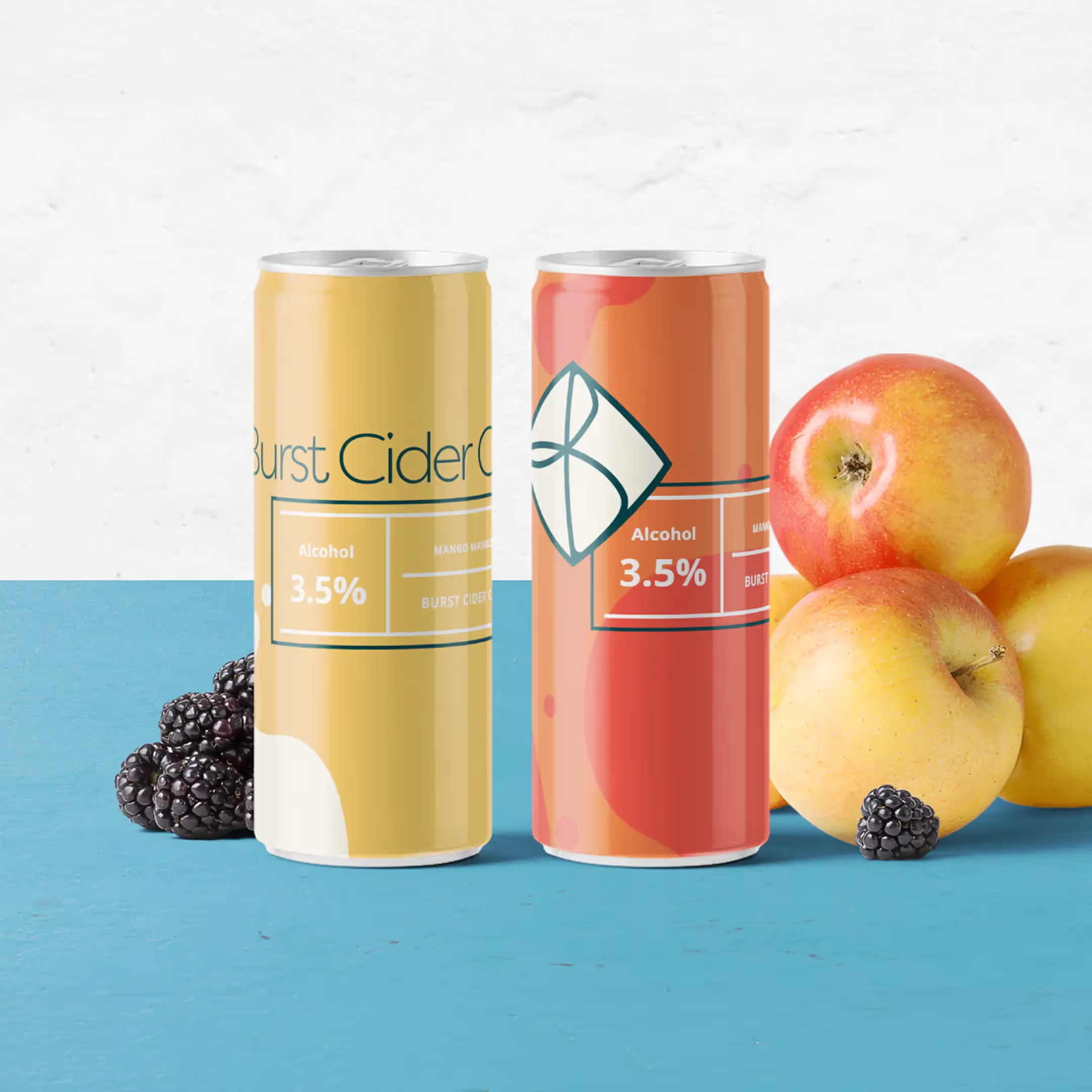
Design treatments to be used as accent/backgrounds in materials
As an added element tying the logotype to the logomark, the tittle on the 'i' in Cider is made of an apple seed. The logo was designed to have a colour system that allowed hundreds of different combos to coincide with the ever changing beverage flavours. In the end one primary and six secondary colour combos were chosen as the mainstays which will be used as distinctive markers of key hard cider flavours.
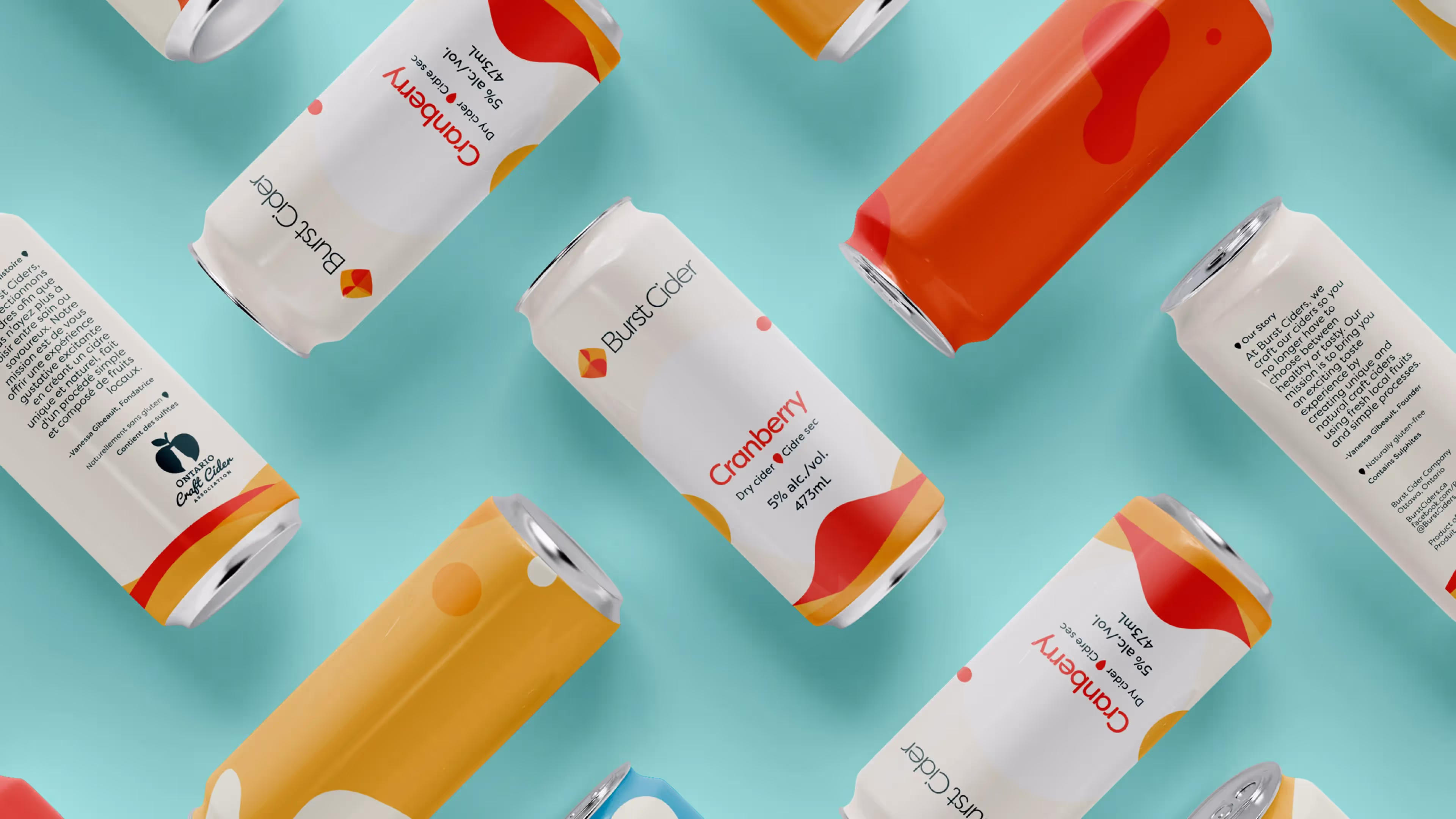
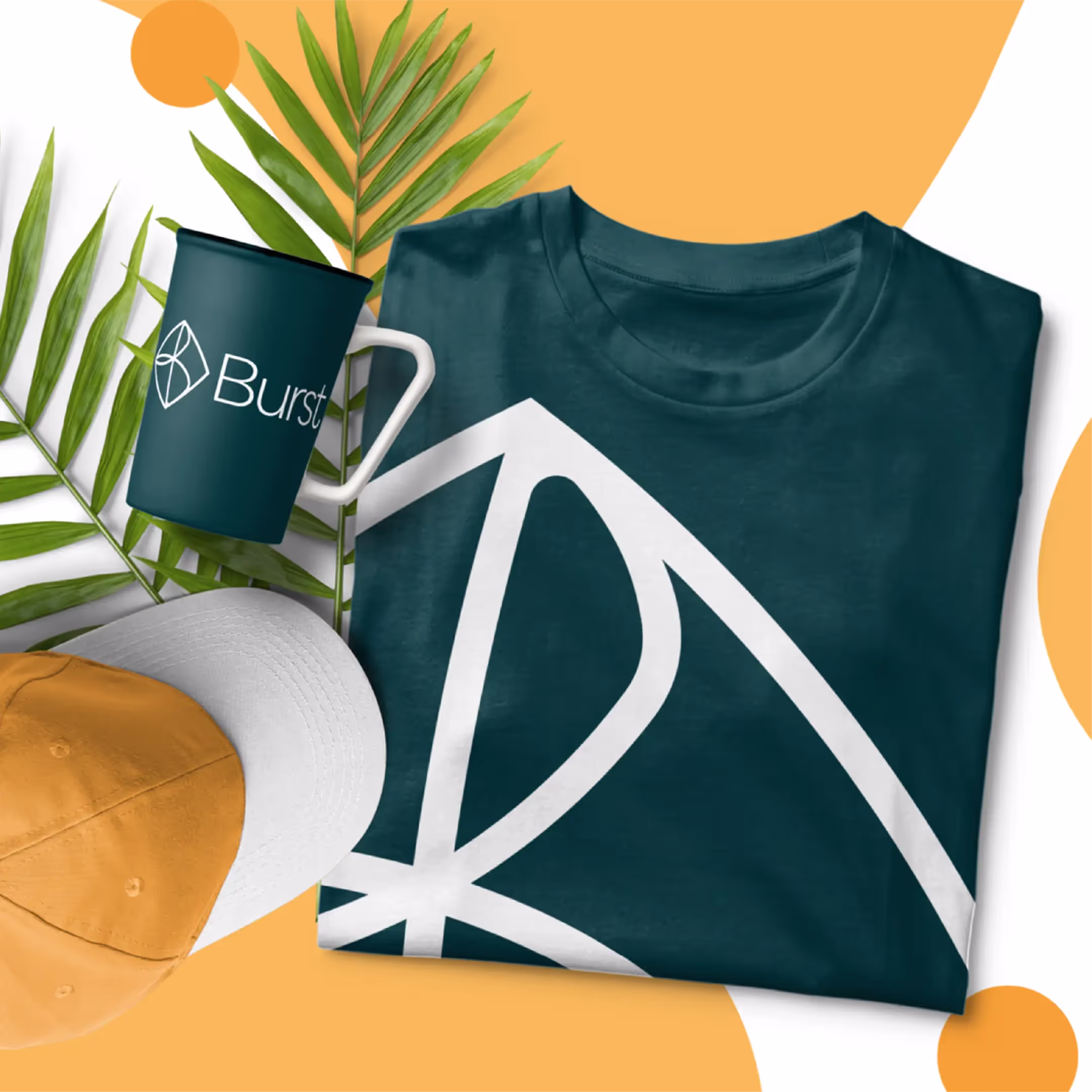
Implementation
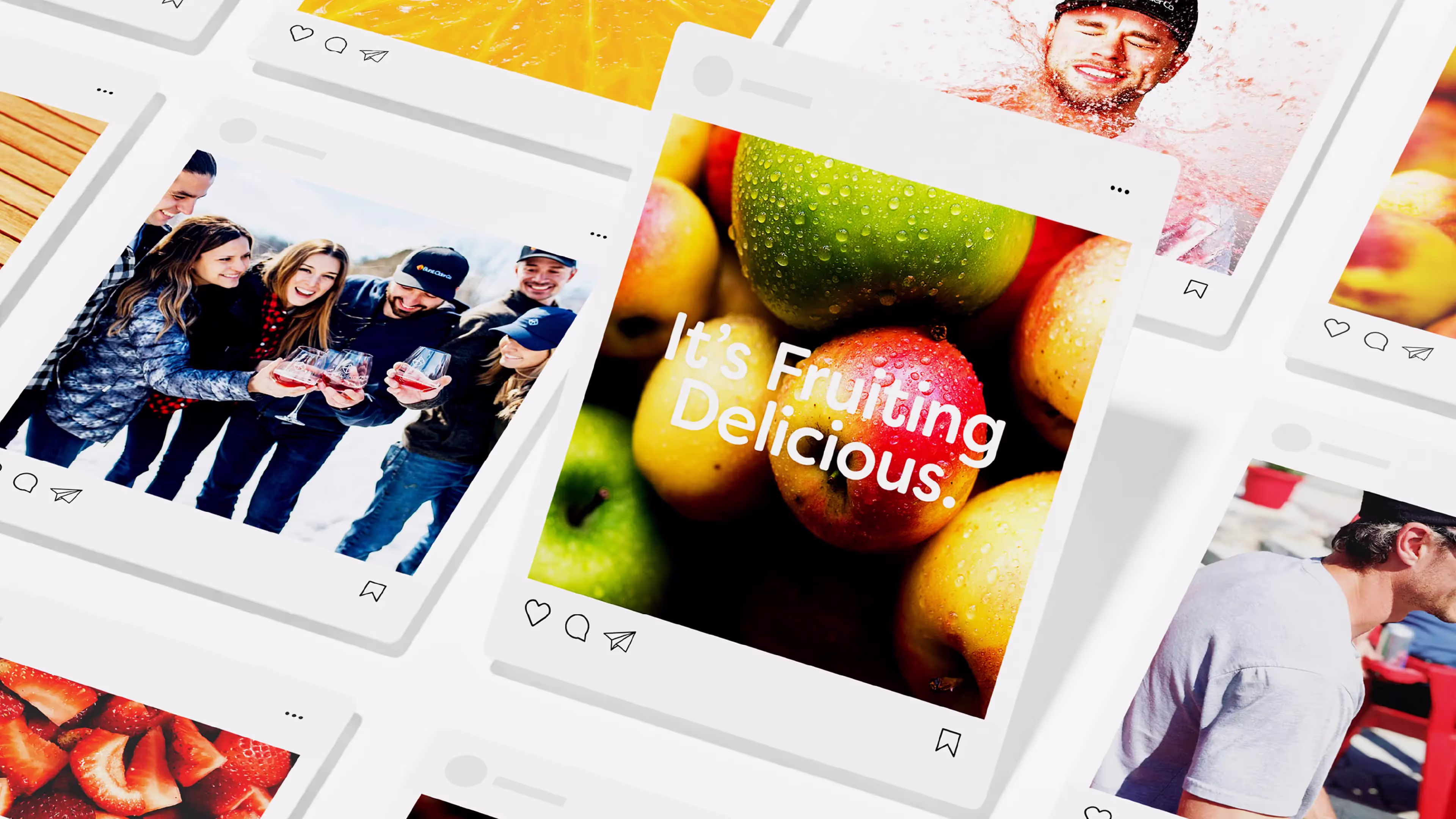
The brand strategy seamlessly translated into various touchpoints, including packaging, marketing materials, and social media templates. Together, we met the challenges with innovative solutions to ensure the brand message was consistently communicated across diverse channels.
"Justin went above and beyond by really connecting with and truly understanding the vision and ideas that stood behind Burst."
results + Outcomes
Over four years, Burst experienced exponential growth, achieving direct sales and securing placements in over 50 establishments across Eastern Ontario and Quebec. The brand's rapid success and growing brand equity led to its acquisition by Orleans Brewing Co. in 2021. Orleans Brewing Co. has since continued the expansion of Burst, introducing new flavours while maintaining the brand's distinct identity.
Burst's journey from a pioneering infused cider maker to a thriving brand acquired by Orleans Brewing Co. is a testament to the power of a thoughtfully designed brand identity rooted in strategy and authenticity. The project achieved (and surpassed) all its goals and paved the way to growth and success within the hard cider market.